After a few weeks in its testing phase, the expected redesign of the Google Play Store reaches the world. The Play Store activates its new Material interface.
This is a visual update that updates the Play Store interface, thus offering a cleaner and premium store. The first change we found is that the colors of its action bar have disappeared. Now we have a completely white interface. Which also opens a new lower navigation bar on mobile phones and on the left on tablets and Chrome OS.
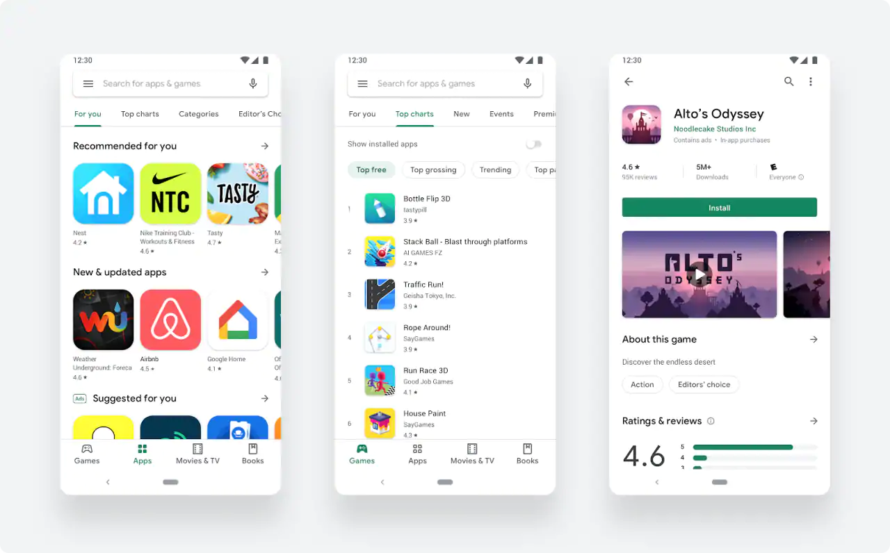
In the new navigation bar, we see the sections to discover games, applications, movies and books. The music section has disappeared, but you can continue to buy songs and albums through the search engine or from the Google Play Music application.
Google Play has also updated the design of the app and game tabs to display more useful information at the top with a larger button. They have also added a new icon system with a more uniform design that makes the content stand out.
There are now two distinct destinations for games and apps, which helps us better serve users the right kind of content. Once users find the right app or game, the updated store listing page layout surfaces richer app information at the top of each page as well as a more prominent call-to-action button. This makes it easier for users to see the important details and make a decision to install your app.
They have not added any new features, we are just facing a redesign of the Play Store. If the old interface still appears, you will only have to close the application and wait a few seconds for the new redesign to be activated automatically.


