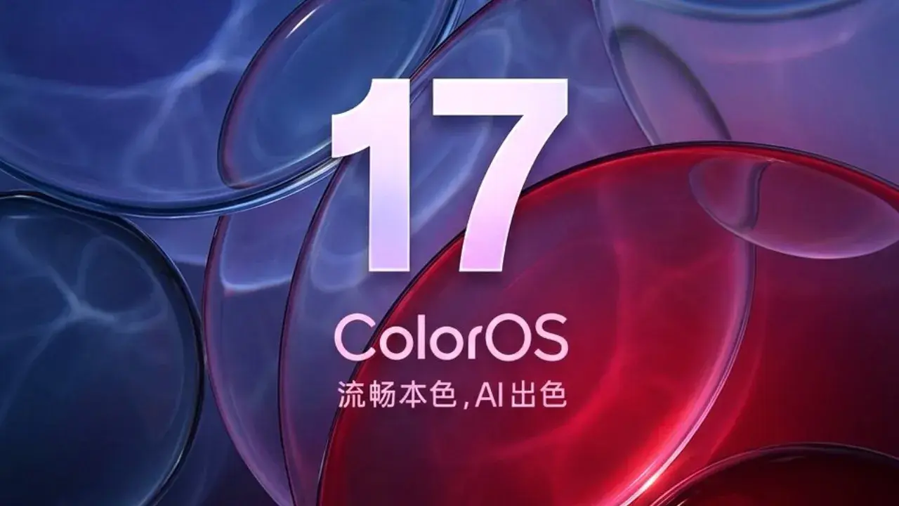
OPPO has officially confirmed that ColorOS 17 will not adopt transparent card designs, despite the growing popularity of translucent interfaces across the Android ecosystem. The company's design team believes readability and usability should come before visual trends, even if transparent effects have become common in modern smartphone software.
The clarification comes directly from Chen Xi, Design Director for ColorOS, who explained the company's design philosophy and why transparency is not part of its current plans.
OPPO Puts Readability Before Visual Effects on ColorOS 17
According to Chen Xi, transparent cards reduce the readability of interface elements. While they may look attractive, they often make text and information harder to distinguish from the background, especially when wallpapers or app content introduce visual distractions.

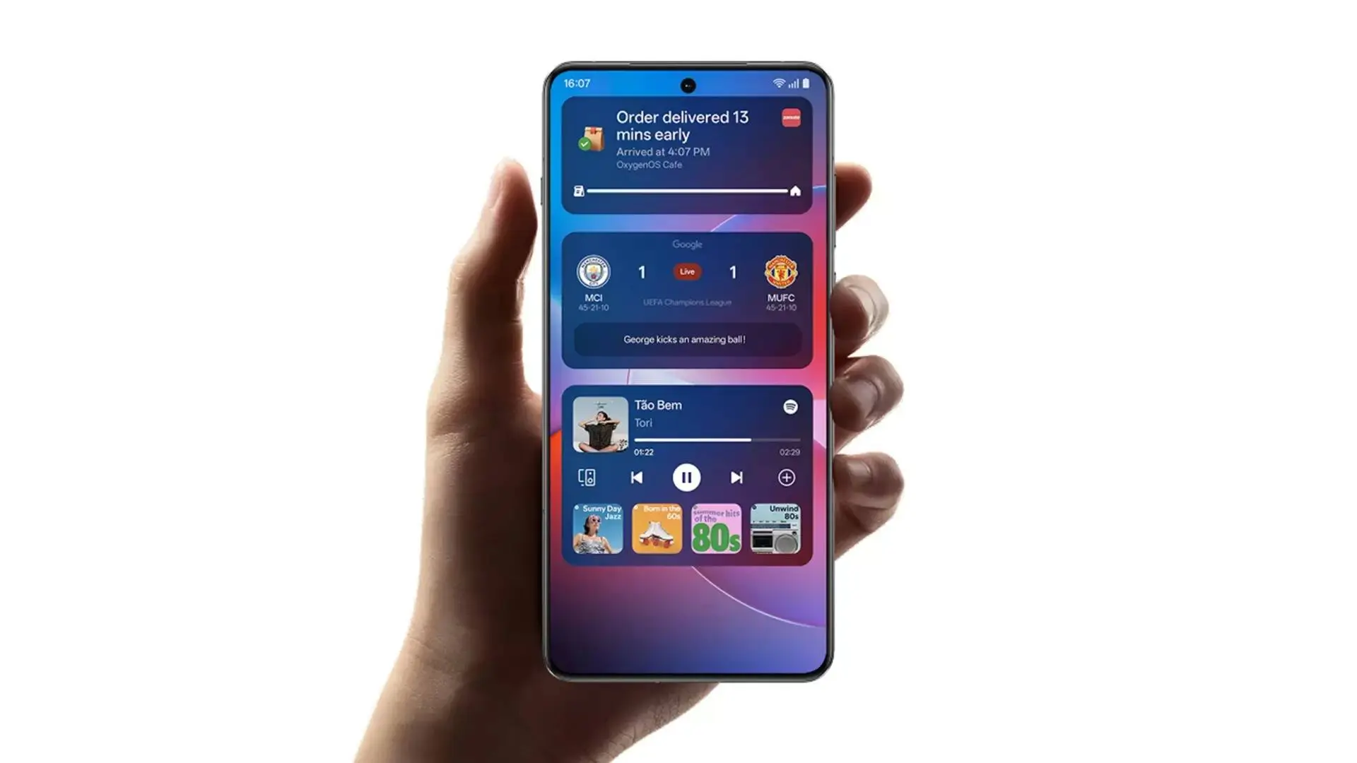
On ColorOS 17, cards are primarily meant to display information quickly and clearly. Making them transparent in ColorOS 17 would compromise that goal and could also limit how developers design and expand their functionality. The company therefore prefers solid, high-contrast cards that remain easy to read regardless of the background or lighting conditions.

Transparent Cards Could Still Appear in Limited Cases
Although OPPO has ruled out transparent cards as a core design element, Chen Xi did not completely dismiss the idea. He revealed that the company could eventually experiment with transparency on a small number of interface elements that do not display important information. However, he emphasized that there are currently no development plans or a release schedule for such features. That means users should not expect transparent widgets or system cards when ColorOS 17, based on Android 17, launches.
Key Points
- OPPO has confirmed that ColorOS 17 will not include transparent card designs.
- The decision was explained by Chen Xi, Design Director for ColorOS.
- OPPO believes transparent cards reduce readability and make information harder to see.
- The company says transparency can also limit the functionality of interface cards.
- ColorOS 17 will continue using solid, high-contrast cards to improve usability.
- OPPO may consider transparency for a small number of non-essential interface elements in the future.
- There are currently no official plans to introduce transparent cards.
- The company's design philosophy prioritizes clarity, readability, and user experience over visual trends.
Read also

A Practical Approach to Interface Design
OPPO says its main goal is to make ColorOS easy to use every day. Instead of following design trends, the company wants users to read information quickly and without distractions.
The company believes solid cards are easier to read than transparent ones. They also make the interface look cleaner and help users find important information faster.
OPPO says every design choice should improve the user experience. Rather than adding effects just because they look modern, the company prefers features that are simple, useful, and easy to understand.
Popular News

Latest News
Loading