Starting from last year we saw a huge change in the way Meizu want to be viewed by the world, and those will continue with a new rumoured Meizu logo design.
For companies in the West changing a company logo is a risky and tricky endeavour. Usually a change is subtle with just enough of a styling change to give a fresh new modern look.
Although they have a long history in the Chinese tech industry, Meizu look like they want to leave behind the ‘old Meizu’ and create a new phone with new look, feel and goals.
The new Meizu Logo is going to come as quite a surprise to all the Meizu fans in China and surely upset all those independent Meizu stores who will now be forced to redecorate, but for the international market it isn’t going to have such an impact.
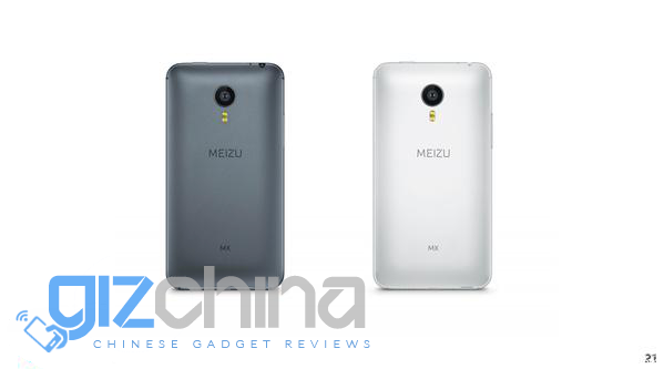
Meizu still haven’t made a huge impact on the international scene and this refresh might be a key change for the company to start a new on the international market.
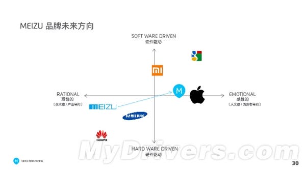
The logo redesign isn’t the only change the company hope to make. Currently they see themselves as a ‘rational’ brand with a slight emphasis on hardware, but they would like to switch that perception to become a more ‘emotional’ company. ‘Emotional’ in the eye of Meizu means ‘More like Apple’ a company that Meizu have long copied and followed.
In my personal opinion Meizu had a huge opportunity to strike it big last year but the company were too stuck in their ways to make important and necessary changes. I doubt that this new logo and hope to follow Apple more than they usually do will be enough to turn the brand around.


They would have been better off just evolving the old logo.
This new logo just lacks. It’s too simple, too generic, and when you make it very small you’re not even going to see the pointless breaks in the E and Z. And the upside down teardrop with the “M” in it….
The old logo looks better, I don’t like the new gizchina logo either.
oh hell…. i dont give a jack about the Logos as long as the prices are insanely good AND the phones are top notch !
You bargain bin fker 😀
bargain bin ? wats that ?
That means your a guy who buys exclusively bargain things – I kind off tend to do this thing with headphones sometimes …. And phones…… Right
nothing bad in doing that …
Old logo was nice. Let’s see what this new change brings in.
Honestly, I used to be disliked the old logo.
New one looks cleaner.
As a marketing guy I love it, it’s fresh and streamlined and has a more mature look to it.
as a graphic designer I hate it. Looks ultra bland, uninspired, forgettable and non de-script. Zero character at all. Old one was so much better
Graphic designers create. Marketers sell. A logo only gets you so far without a great product, Meizu has that. This logo will be very easy to sell.
Might sell, but looks awful. Detracts from the brands visual and aesthtic appeal in my opinion. Cheapens the brand with its bland detailing, screams generic Chinese phone brand, which meizu are not, they are a cut above. Actually really disappointing, one of the reasons I like meizu is their attention to detail and understanding of design principles. They have misjudged this horribly.
Time will soon tell, for now we have to disagree. I think this will help them when they expand internationally, you don’t.
You probably think the new gizchina logo is totally awesome and a step in the right direction too, right?
Nope actually not a fan of it, think it’s a little to juvenile looking. I do love how you think you have me all figured out, it’s hilarious how hard you try.
I just know you love to dominate the comments, often with 20%+ of the comments being yours — but then again, you’re a “marketing guy” so you should know that already.
Only 20%?? I must be slipping lately. This is marketing at it’s finest and it has already got me recognition from several sources in this industry including phone brands and resellers.
Sales managers sell, marketers create communication pieces that in turn sell the product. You’ve got it all mixed up; you don’t even need a great product if you have fantastic marketing. Great marketing is usually the number one reason why bad products sell. Remember the pet rock?
Yes and how many pet rocks are still sold today? After the initial sales died down their sales came to a crashing halt. The Pet Rock was introduced in 1975 and was off the shelves by 1976, once people realized it was something they could make themselves.
A good ad campaign and good marketing can get you initial sales but if you want sustained sales and you want to grow your brand you need a good product. Consumers have very short term memory and one bad product or bad idea can sink a business no matter how good the marketing is. I see it every single day.
To follow up I don’t know a single Sales Manager that does any selling. The sales manager provides training, leadership, monthly/weekly/quarterly goals etc. Account Managers on the other hand work directly with the customers and are responsible for sales. And then there are Brand Managers and Product Managers who have a more focused assignment. Completely different job titles.
Haha I knew you would fall for this.
The old was a lot better and I would have opted for an evolution of the old logo VS this cute bubbly thing which will not stand the test of time and has zero potential for becoming iconic.
Anyone with real graphic design ability (the do-ers) would understand this new logo is just “meh” and pretty generic at best. I’m guessing you’re one of those talking-type marketing guys.
Anyone with real business sense (the money makers) would understand this new logo has much more potential to stand out than the old one did, simple is a lot easier to sell especially to the American market.
While some of the best logos are the simplest, doesn’t mean just because a logo is simple therefore it must be good. The new logo just lacks and will not stand the test of time. You said “fresh” because you fell for the white text on a nice light blue background, look what happens when you strip away all the color…
I said fresh because of the way the letters look, it had very little to do with the colors. Even the picture above it looks a lot fresher and cleaner than their old logo. Nor did I ever see that simple always means good, I am talking in this case and only this case. Every other logo is a case by case basis.
and anyone with real business sense would quickly realize Meizu’s biggest challenge with selling to the American market is not the logo but their Chinese-sounding name itself which does not inspire consumer confidence or quality.
Their biggest challenge is that no one has heard of them in America, they get very little press coverage, they arent sold in major US retailers and they don’t advertise in the US. It has very little to do with their name sounding too Chinese.
Balcobomber you’re wrong. Their name does sound too chinese, same with xiaomi, Jiayu, oukitel to name a few. As angry mobile nerd said it does not inspire consumer confidence or quality. I’ve tried advertising them to friends but it’s laughed off like some inferior brand just because of its name. It makes me angry at times but what can you do? These chinese brands have got to start advertising in the west. The only thing I’m worried about though is the price, once you start selling in the west prices like to soar! Meizu label themselves as rational at the moment and from my opinion this means the specs to price ratio is rational, they want to move towards emotional where the specs to price ratio is irrational just like apples. I think meizu will fail at this miserably unless they start advertising A LOT!
The name sounding too Chinese isn’t why people laugh it off. You could do the same thing with European, Korean, or even America brands. Those same people will laugh off the American company Blu (who sells Chinese phones rebranded). Blu is the furthest thing from a Chinese sounding name. They laugh it off because they have never heard of it period. Any consumer who has never heard of a brand before will have trouble with the quality of it, regardless of which country it comes from.
Previous logo was better
Any source on this?
I highly dislike it. It looks like a random font from DaFont.
Then again, their logo is the least of their problems.
Old logo was crap…This one looks cleaner, hopefully so will their phones….
what’s the reason behind the detached e and z?
They would have been better off just evolving the old logo.
This new logo just lacks. It’s too simple, too generic, and when you make it very small you’re not even going to see the pointless breaks in the E and Z. And the upside down teardrop with the “M” in it….
The old logo looks better, I don’t like the new gizchina logo either.
oh hell…. i dont give a jack about the Logos as long as the prices are insanely good AND the phones are top notch !
You bargain bin fker 😀
bargain bin ? wats that ?
That means your a guy who buys exclusively bargain things – I kind off tend to do this thing with headphones sometimes …. And phones…… Right
nothing bad in doing that …
Old logo was nice. Let’s see what this new change brings in.
Their designers are better than their developers (lollipop for mx4 pro is a shame)
Lollipop is a shame for just about everyphone it has been released for. Google can’t even get it right on their own Nexus line nevermind other devices.
and when the wake up feature doesn’t work should we blame lollipop as well ?
Considering one of the new features of Lollipop involves wake up, it could very well be Lollipop that is at fault.
wake up was included with kitkat :/
Yes but it was improved for Lollipop.
Honestly, I used to be disliked the old logo.
New one looks cleaner.
As a marketing guy I love it, it’s fresh and streamlined and has a more mature look to it.
as a graphic designer I hate it. Looks ultra bland, uninspired, forgettable and non de-script. Zero character at all. Old one was so much better
Haha I knew you would fall for this.
The old was a lot better and I would have opted for an evolution of the old logo VS this cute bubbly thing which will not stand the test of time and has zero potential for becoming iconic.
Anyone with real graphic design ability (the do-ers) would understand this new logo is just “meh” and pretty generic at best. I’m guessing you’re one of those talking-type marketing guys.
Anyone with real business sense (the money makers) would understand this new logo has much more potential to stand out than the old one did, simple is a lot easier to sell especially to the American market.
Graphic designers create. Marketers sell. A logo only gets you so far without a great product, Meizu has that. This logo will be very easy to sell.
Might sell, but looks awful. Detracts from the brands visual and aesthtic appeal in my opinion. Cheapens the brand with its bland detailing, screams generic Chinese phone brand, which meizu are not, they are a cut above. Actually really disappointing, one of the reasons I like meizu is their attention to detail and understanding of design principles. They have misjudged this horribly.
While some of the best logos are the simplest, doesn’t mean just because a logo is simple therefore it must be good. The new logo just lacks and will not stand the test of time. You said “fresh” because you fell for the white text on a nice light blue background, look what happens when you strip away all the color…
and anyone with real business sense would quickly realize Meizu’s biggest challenge with selling to the American market is not the logo but their Chinese-sounding name itself which does not inspire consumer confidence or quality.
Sales managers sell, marketers create communication pieces that in turn sell the product. You’ve got it all mixed up; you don’t even need a great product if you have fantastic marketing. Great marketing is usually the number one reason why bad products sell. Remember the pet rock?
Yes and how many pet rocks are still sold today? After the initial sales died down their sales came to a crashing halt. The Pet Rock was introduced in 1975 and was off the shelves by 1976, once people realized it was something they could make themselves.
A good ad campaign and good marketing can get you initial sales but if you want sustained sales and you want to grow your brand you need a good product. Consumers have very short term memory and one bad product or bad idea can sink a business no matter how good the marketing is. I see it every single day.
Their biggest challenge is that no one has heard of them in America, they get very little press coverage, they arent sold in major US retailers and they don’t advertise in the US. It has very little to do with their name sounding too Chinese.
I said fresh because of the way the letters look, it had very little to do with the colors. Even the picture above it looks a lot fresher and cleaner than their old logo. Nor did I ever see that simple always means good, I am talking in this case and only this case. Every other logo is a case by case basis.
Time will soon tell, for now we have to disagree. I think this will help them when they expand internationally, you don’t.
You probably think the new gizchina logo is totally awesome and a step in the right direction too, right?
Nope actually not a fan of it, think it’s a little to juvenile looking. I do love how you think you have me all figured out, it’s hilarious how hard you try.
To follow up I don’t know a single Sales Manager that does any selling. The sales manager provides training, leadership, monthly/weekly/quarterly goals etc. Account Managers on the other hand work directly with the customers and are responsible for sales. And then there are Brand Managers and Product Managers who have a more focused assignment. Completely different job titles.
I just know you love to dominate the comments, often with 20%+ of the comments being yours — but then again, you’re a “marketing guy” so you should know that already.
Only 20%?? I must be slipping lately. This is marketing at it’s finest and it has already got me recognition from several sources in this industry including phone brands and resellers.
Balcobomber you’re wrong. Their name does sound too chinese, same with xiaomi, Jiayu, oukitel to name a few. As angry mobile nerd said it does not inspire consumer confidence or quality. I’ve tried advertising them to friends but it’s laughed off like some inferior brand just because of its name. It makes me angry at times but what can you do? These chinese brands have got to start advertising in the west. The only thing I’m worried about though is the price, once you start selling in the west prices like to soar! Meizu label themselves as rational at the moment and from my opinion this means the specs to price ratio is rational, they want to move towards emotional where the specs to price ratio is irrational just like apples. I think meizu will fail at this miserably unless they start advertising A LOT!
The name sounding too Chinese isn’t why people laugh it off. You could do the same thing with European, Korean, or even America brands. Those same people will laugh off the American company Blu (who sells Chinese phones rebranded). Blu is the furthest thing from a Chinese sounding name. They laugh it off because they have never heard of it period. Any consumer who has never heard of a brand before will have trouble with the quality of it, regardless of which country it comes from.
Previous logo was better
Any source on this?
I highly dislike it. It looks like a random font from DaFont.
Then again, their logo is the least of their problems.
Old logo was crap…This one looks cleaner, hopefully so will their phones….
what’s the reason behind the detached e and z?
Their designers are better than their developers (lollipop for mx4 pro is a shame)
Lollipop is a shame for just about everyphone it has been released for. Google can’t even get it right on their own Nexus line nevermind other devices.
and when the wake up feature doesn’t work should we blame lollipop as well ?
Considering one of the new features of Lollipop involves wake up, it could very well be Lollipop that is at fault.
wake up was included with kitkat :/
Yes but it was improved for Lollipop.
‘enough to turn the brand around’. Don’t think thr brand needs turning around at all, not sure where this came from. My Meizu m2 runs like an absolute dream and the firmware and Ui is infinitely smoother and more well optimized than MIUI in my opinion. Both the M2 note and Mx5 are also great devices, the brands looking pretty damn good at the minute and already making inroads into europe by selling direct on amazon.
‘enough to turn the brand around’. Don’t think thr brand needs turning around at all, not sure where this came from. My Meizu m2 runs like an absolute dream and the firmware and Ui is infinitely smoother and more well optimized than MIUI in my opinion. Both the M2 note and Mx5 are also great devices, the brands looking pretty damn good at the minute and already making inroads into europe by selling direct on amazon.
Boring, indeed, but generic logos sanitized to be universally inoffensive are increasingly the norm. The old Meizu logo has been around almost from the founding of the company and could be refined to a better end than this POS. Actually their very first logo was pretty bad as well. If EICO came up with this new one (although I doubt it) they should be ashamed. Meizu’s marketing has always been adolescent, though; way behind the engineering and software.
Boring, indeed, but generic logos sanitized to be universally inoffensive are increasingly the norm. The old Meizu logo has been around almost from the founding of the company and could be refined to a better end than this POS. Actually their very first logo was pretty bad as well. If EICO came up with this new one (although I doubt it) they should be ashamed. Meizu’s marketing has always been adolescent, though; way behind the engineering and software.