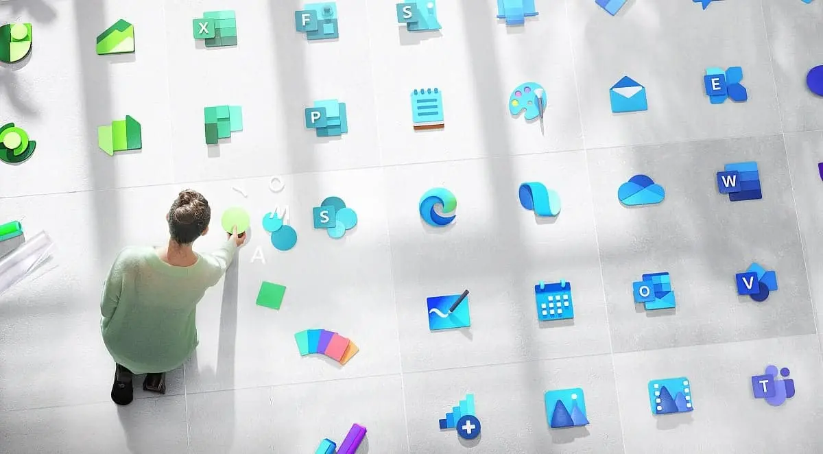
Microsoft has redesigned over 100 Windows icons with new colors, materials, and finishes, The restyling of the icons started with the Office suite at the end of 2018 and continued during 2019 on other apps like Microsoft Edge, and involves a total of a hundred new icons.
Microsoft is continuing to renew the icons of its old Windows apps. According to the guidelines of the new design language, bringing new images, colors and shades.
100 new icons in fluent Design
"Last year, we rolled out the new Office icons to show our customers that we’ve evolved our products to support the changing world of work. A world where, despite being more mobile than ever before, social connectedness and collaboration are paramount to success. A world with immense potential for creativity and growth thanks to new flows of information". said Jon Friedman, Head of Microsoft Office design team in a blog post at Medium.

He added "Across Microsoft, we’ve worked to help facilitate and enhance these kinds of interactions and experiences. Scaling an icon design effort from 10 products to over a hundred. To reflect this new world of work was both daunting and thrilling".
It is worth to mention that as Microsoft has just released the new update of Windows 10, a new phishing campaign takes the opportunity to spread in the form of an email, prompting users of Windows 10 to install a critical update. Researchers at Trustwave have released details of this new threat. It attempts to trick users into hijacking their PCs and demanding a ransom.
The e-mail, which is currently in English and seems to come from Microsoft, has the subject ” Install Latest Microsoft Windows Update now!” or “Critical Microsoft Windows Update!” And prompt the reader to install the included update as an attachment. In reality, it is a program that downloads a ransomware called Cyborg.
What do you think of the new icons for Windows 10? Which ones do you like the most? Let us know by leaving a comment below.
Popular News


Latest News
Loading