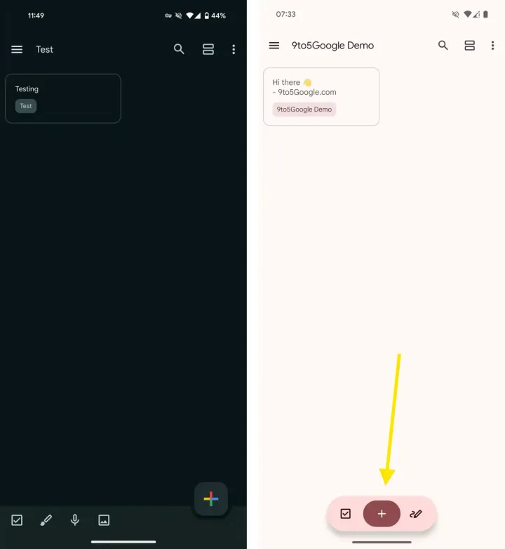
Google Keep, a popular note-taking application known for its simplicity and ease of use, is undergoing a significant interface redesign. This update prioritizes a cleaner aesthetic and increased note visibility, focusing on a novel floating action hub in place of the current bottom button panel.
Google Keep Gets a Minimalist Makeover: Farewell Bottom Bar, Hello Floating Action Hub

Image Credit: 9to5google
While Google Keep excels in offering a user-friendly platform for capturing ideas, its interface has witnessed some clutter build-up, particularly within the bottom button section. This redesign acknowledges this concern and implements a more minimalistic approach.
Moving Forward: From Fixed Panel to Dynamic Hub
The current iteration of Google Keep features a fixed bottom bar. It boasts a prominent "+" button for creating new notes and four additional buttons for generating notes with specific elements. It include checklists, drawings, voice recordings, and images. Though convenient, this static panel consumes valuable screen real estate, especially when viewing numerous notes.
The upcoming update bids farewell to this bottom bar in favor of a dynamic floating action hub. Visually, it transforms into a pill-shaped button, maintaining the core functionality of the "+" button for quick note creation. Flanking this central element are shortcuts for generating notes with checkboxes and drawings.
While this streamlined approach eliminates direct one-tap access to image and audio notes, it empowers users with a less cluttered interface and a more expansive canvas for viewing notes. Additionally, the ability to create image and audio notes remains readily available. Users can simply create a new note and then seamlessly attach the desired media.
A Glimpse into the Future of Interface Design?
This innovative floating action hub could potentially establish a design precedent for future Google applications. While it currently deviates from the established Material Design language, this redesign paves the way for a more intuitive and visually appealing user experience.
The trade-off between direct access and a cleaner interface presents an intriguing proposition. Replacing the dedicated buttons for specific note types with a dynamic hub offers a more streamlined feel at the expense of immediate one-tap access. However, the ability to attach the desired media within a standard note mitigates this potential inconvenience.
So, ultimately, this redesign reflects Google's commitment to continuously refining Google Keep. By prioritizing a minimalist aesthetic and maximizing note visibility, the new interface aims to enhance user productivity and foster a more engaging note-taking experience. The success of this novel floating action button approach will hinge on user reception and its potential integration with the broader Material Design framework.
Loading


