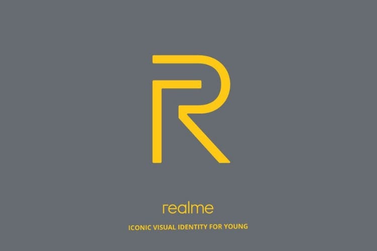
Oppo’s former sub-brand Realme had a very successful start to its campaign, as the company is mainly focused on introducing value-for-money smartphones in India. It is going to be almost one year since the sub-brand launched its first device. Since then, Realme had launched 3 more devices and evidently, all became a success. Now, Realme has decided to take the company to another level and the first step they to that is by introducing its new brand logo.
Today, Realme took to its official Twitter account to unveil its new brand logo to the world. The tweet goes by ‘It’s not just a new logo! It’s a new us, an iconic visual identity designed for the young!’ which of course justifies that the company vision is to focus on youth. Furthermore, Realme’s founder and CEO Sky Li said: “As a global, youth-facing smartphone brand, Realme is continuing to introduce new products that feature a stylish design and a powerful performance.”
It’s not just a new logo! It’s a new us, an iconic visual identity designed for the young! Hit the Like button if U like the new us. #ProudToBeYoung pic.twitter.com/KMhOBxhIl5
— Realme (@realmemobiles) November 15, 2018
Let’s take a dig at the new logo. The new logo has two R’s from which one is an uppercase ‘R’ which represents the company inspiration to provide youth with devices which are valuable for their money and the lowercase ‘r’ represents the youngsters itself.
Also, there are some rumours in the media related to the brand’s upcoming new U series which just got really strong by the latest Realme tweet saying ‘Hit the like button if U like the new us’. The new phone is expected to be the company’s first featuring Helio P70 chipset. This also suggests that the upcoming device could be the first to carry the new logo.


