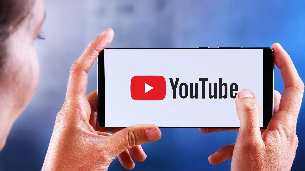
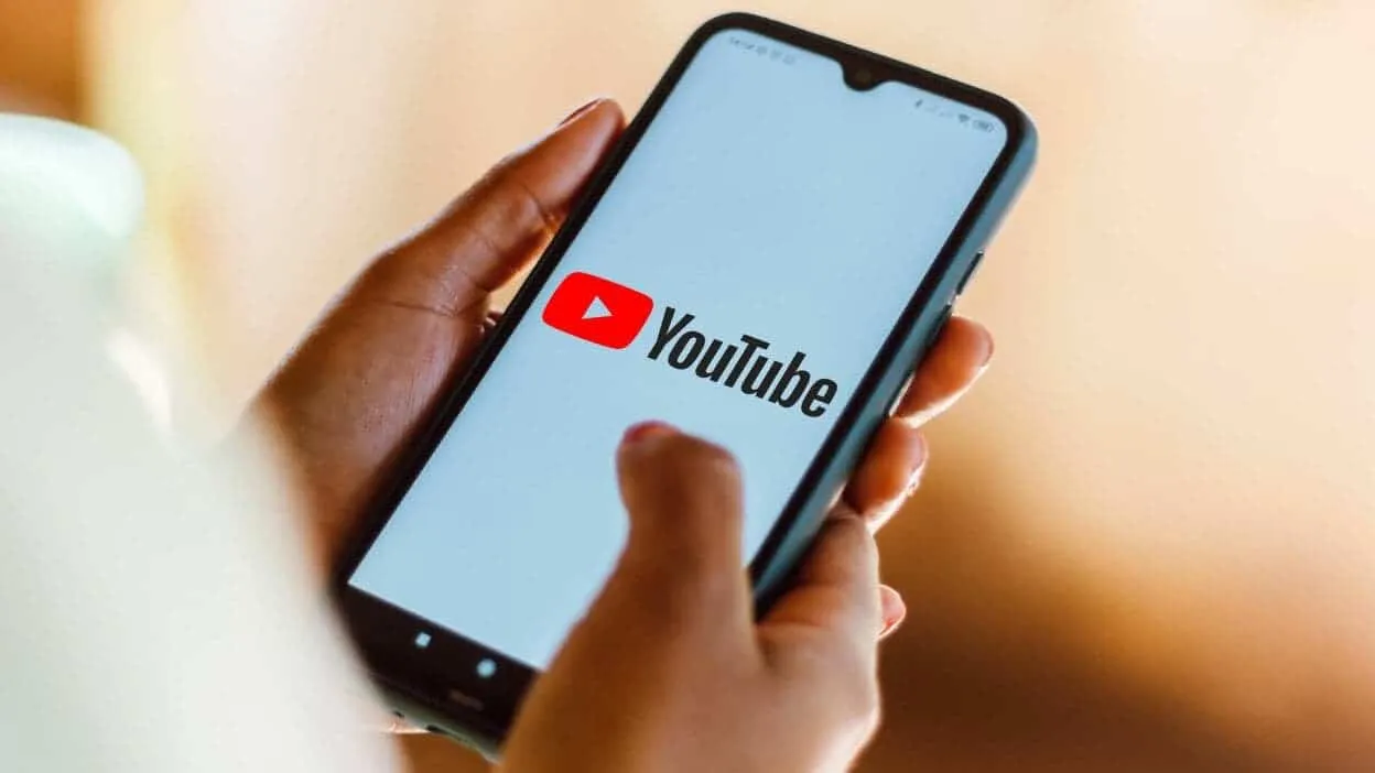
YouTube is giving its app a makeover. The world's most popular video platform is starting to roll out a new design. This update will first begin with Android phones. The changes include cleaner menus and softer colors. The goal is to create a more modern feel. This is to help users reconnect with the latest YouTube user interface.
You will notice the biggest difference when you watch a video. The player now has semi-transparent buttons and icons. This makes the controls less distracting. It helps you focus more on the video itself without being distracted by solid-colored buttons and overloaded menu items.
A More Fun and Personal Feel

The new design also adds some playful touches. When you tap the "Like" button, a small animation appears. This animation changes based on the video you are watching. For example, a music video might show a little musical note. This makes your interaction feel more personal.
Other actions in the app now have smoother animations too. Adding a video to a playlist feels more dynamic. These small details make the whole app feel more responsive and engaging.
A Cleaner Way to Read Comments on YouTube

The comment section has received a major upgrade. It now uses a threaded layout. This means you can easily see replies to a comment. It looks like a conversation thread, which is much easier to follow.
For years, people found YouTube comments messy and hard to read. This change should fix that. It will make talking with creators and other viewers much more enjoyable.
You can get this new look by updating your YouTube app from the Google Play Store. If you do not like the changes, you can tell YouTube directly. Use the feedback option inside the app or on their website. The same update will come to iPhones very soon.
Popular News
Latest News
Loading