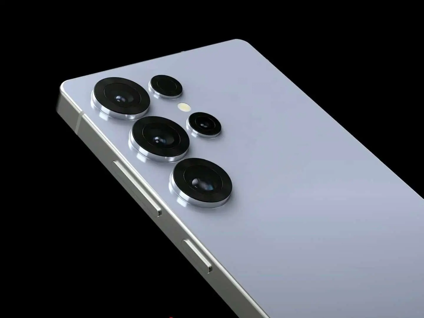
Samsung changes the S Pen again as Galaxy S26 Ultra stylus drops full color look
SamsungWednesday, 04 February 2026 at 00:56
Samsung appears ready to stir fresh talk around
its flagship phone, not through the device itself, but through its stylus. New
images shared by a Dutch site, NieuweMobiel.nl, give an early look at the S Pen meant for the
Galaxy S26 Ultra. The change is not clear at first glance and marks a quiet shift
away from its long held style choices tied to the Ultra line.

A sharp break from past stylus style
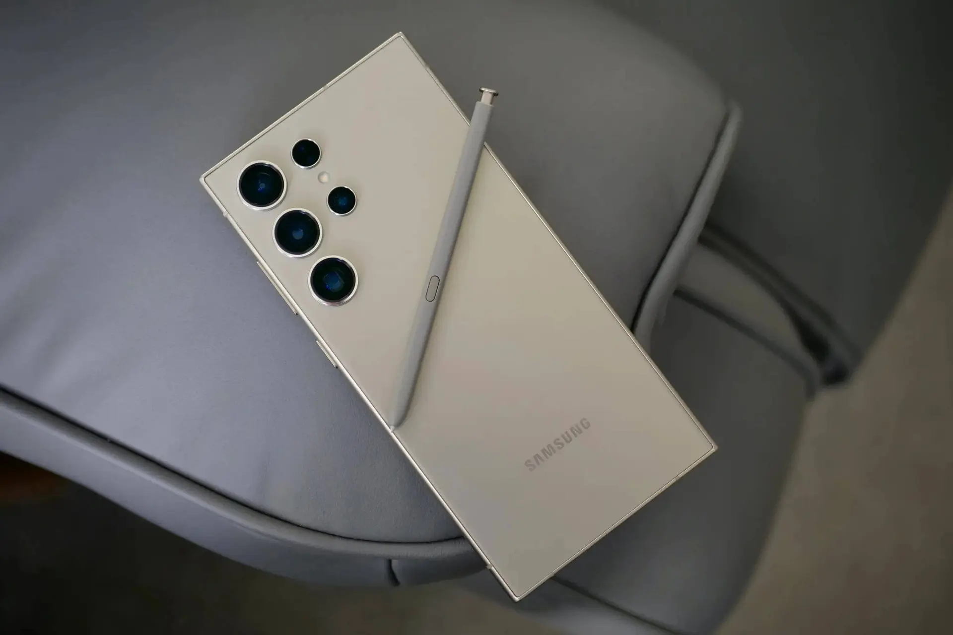
For years, the S Pen
matched the phone shell in full, from top to tip. The upper part takes a metallic look. That pattern now seems to have ended. The
new stylus uses a clean two-color look, with the pen body shown only in black
or white. Near the top end of the pen where the click cap sits, the color tends
to deviate a little. This single splash of color lines up with the phone shade, while
the rest stays plain.
Read also
This move trims the link between phone and pen in
a way some fans may not expect. The four color options for the Galaxy S26 Ultra
still play a role, though only in that small top area. Those shades include a
Cobalt
Violet, Black Shadow, White Shadow, and Galactic Blue. The rest of the
pen keeps the same base look across all models.
What stays and what stays gone
While the look has
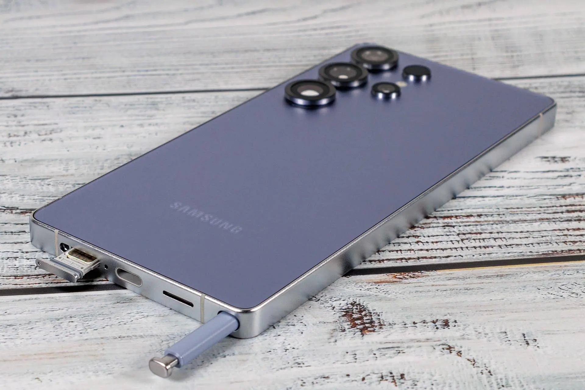
changed, much of the pen’s core use stays the same. The new S Pen keeps its
side key and the spring push at the end. These parts hint that Samsung sees
value in keeping the feel users know. Yet one past feature still does not
return.

The stylus once had
a link feature that let users wave the pen to control the phone from afar. That
tool is still absent here. The new pen shows no sign of that link or its
gesture use. This choice suggests Samsung is firm on cutting that part, even as
it tweaks the pen’s look.
More add Ons hint at launch plans
The same report
also shows other add ons meant for the Galaxy S26 line. These include screen
guards made to cut glare, along with clear cases meant to show off the phone
finish. These items point to a focus on look and feel, rather than bold new
tools.

Taken together, the new pen and add ons paints a calm
picture of change. Samsung seems set on slow shifts in style, while keeping
core use steady. Whether fans see this as clean and fresh, or dull and safe,
will depend on how much value they place on color unity over simple design.
Popular News
Latest News
Loading