ColorOS 17 Official Promotional Video Highlights New Fluid Design and Light Visual Effects
OppoMonday, 14 September 2026 at 16:32
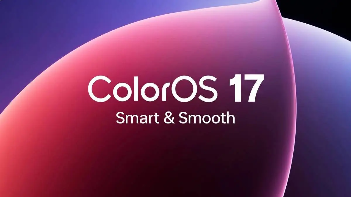
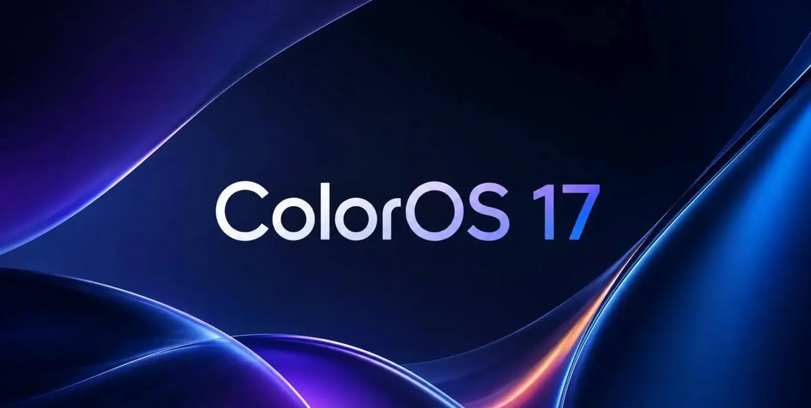
OPPO has shown ColorOS 17 in a new promotional video. It gives us a closer look at the new design before the official launch on September 17.
The main focus is a new fluid design. OPPO has been teasing it for weeks. Now we can see it working across the interface.
A more fluid interface
The new design uses light, reflections, and layered effects. These effects change as you move around the system.
Animations are also more connected. One screen can flow into the next instead of simply being replaced.
This builds on OPPO's Fluid Fusion approach. Design Director Chen Xi has shown parts of the new system in earlier teasers.

Smoother animations and touch
ColorOS 17 is not just new looks.
OPPO is also working on animations and touch response. Swipes and taps are meant to feel faster and more natural.
The company wants the interface to respond quickly to your actions. That should make everyday use feel smoother.

OPPO and glass effects
ColorOS 17 has plenty of transparent and glass-like elements. That has naturally led to comparisons with Apple's Liquid Glass design in iOS 26.
OPPO says its own approach is focused on clarity. The company has worked to keep the interface transparent while making text easier to read.
It has also reduced unnecessary visual effects.

Floating navigation
Another major change is the new floating navigation design.
The feature is designed to work across the system and its built-in apps. Earlier teasers also showed elements stretching and moving with the user's gestures.
Full reveal is coming soon
OPPO will officially introduce ColorOS 17 on September 17 at its Developer Conference in Zhuhai.
For now, the promotional video gives us a good idea of what to expect. ColorOS 17 is putting a lot of attention on smooth motion, clearer visuals, and a more connected interface.
Popular News
Latest News
Loading