Samsung One UI Design Feedback: The Push for Uniform Blur Effects
SamsungMonday, 29 June 2026 at 06:43
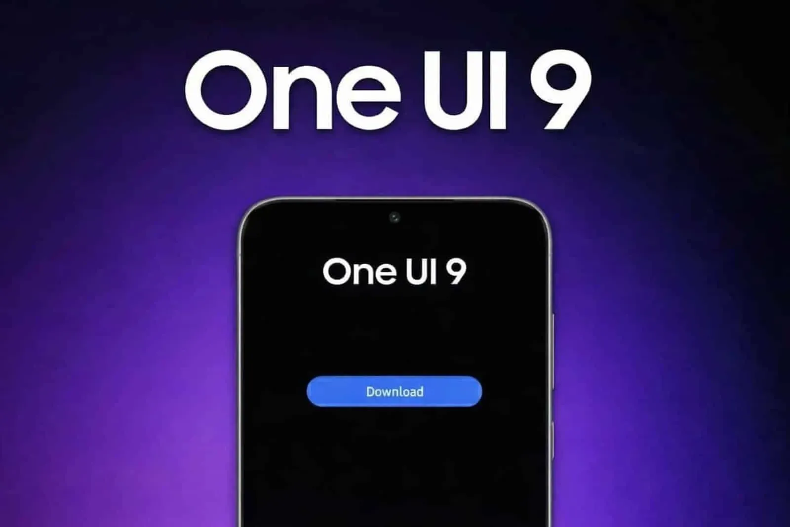
The user interface design of Samsung’s One UI has recently become a focal point of discussion regarding its visual consistency and animation fluidity. Specifically, the implementation of blur effects across the operating system is being highlighted as a critical area for improvement. Users and observers, like IceUniverse, have noted that while certain elements within the interface show promise, there is a distinct need for Samsung to achieve greater uniformity in how these blur effects and animations are applied throughout the entire user experience.
One UI: The Blur Effects Aren't Yet Adequate For Some Users
The core of the discussion centers on the potential for One UI to offer a superior interface if the blur effects were implemented consistently across all widgets and system elements. Currently, the disparity in how these visual elements appear suggests that Samsung has not yet reached the level of uniformity required to provide a truly cohesive user interface. By ensuring that blur effects are applied uniformly across all widgets and system components, Samsung could significantly elevate the aesthetic and functional quality of its software.

Achieving this level of design consistency is seen as the key to unlocking the full potential of One UI. When Samsung successfully implements these blur effects and animations throughout the entire UI, it will undoubtedly offer one of the best user interface experiences available on the market. The current feedback emphasizes that while individual elements may look good, the overall system requires a more standardized approach to visual design. This uniformity is essential for creating a seamless and professional look that users expect from a modern operating system.
Key Points
- Visual Fluidity Focus: Users point out that One UI needs better consistency across its system-wide background blur effects and animation paths.
- Widget Disparity Issues: Current software versions display a distinct layout mismatch between real-time quick panel blurs and stagnant widget styling.
- Demand for Uniformity: Standardizing these design rules across all home screen widgets is crucial for delivering a truly cohesive software look.
- Premium Market Appeal: Bringing matching glass-like transparency values to every stock element will elevate Samsung's overall aesthetic quality.
- Polished User Experience: Resolving these minor visual gaps ensures a professional, high-tier interface that satisfies modern smartphone buyers.

Some users question why the blur effects are almost unnoticeable in the Dark Mode due to the "too dark" notifications.
In short, Samsung needs to focus on adding clean blur effects everywhere in One UI. Making these visual styles look the same on all widgets and animations will quickly fix the current design bugs. This simple step is the best way to build a top-tier layout that feels smooth and looks great. The main goal is to make every part of the screen work together perfectly, giving all Samsung users a clean and polished experience.
Perfect or not, Samsung has been doing a great job since the arrival of One UI. The update is improving year after year, and the visual identity has been following the trends carefully. One thing we know, the brand has been doing a solid job in terms of support. Once it manages to cut the corners of its software, Samsung will pretty much establish itself (if it hasn't already) as one of the best brands for software support.
With Android 17 among us, the brand is expected to intensify its plans in OneUI 9, and we should see some new design elements.
Loading