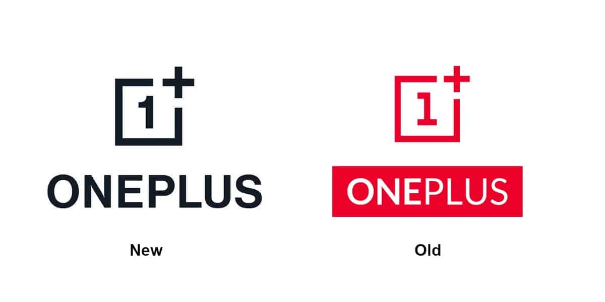
As OnePlus promised a couple of days back, the company’s logo has now received an official mild makeover after remaining unchanged for the past few years. The company made the new “One” logo official today after its patents had leaked online. Accompanying the new logo and fonts are a bunch of other OnePlus logos that seem to have been created in the process by the community fans and look a lot more flashy and colourful than the new original ones.
Gizchina News of the week
Putting both the logos side-by-side, you’ll notice not a lot has changed. More importantly, the Black colour adorned by the new logo doesn’t seem to be unanimous as some places still have the iconic White + Red colour intact. This colour scheme is something OnePlus always kept respect of even in its products by including similar coloured chargers and cables. Apart from that, the fonts have had a slight change. There are some other more subtle changes as well if you look closely. Most of the company’s official websites and forums have already applied the new design and fonts, as far as we could verify.
Interestingly, OnePlus didn’t take the opportunity to announce the launch date of the OnePlus 8 series, as we suspected. Strong speculation has suggested that the brand is ready to unveil the series sometime next month, if not on April 15th.





It’s alright. You could argue that before the ‘1’ looked like a particular ‘L’ font or something. Also, there’s been a trend to simplify design and make things more bold, thick-stroked to help better visibility. Especially in a day and age where things are watched on smartphones and logos appear on even smaller things like smartwatches. Gotta have a logo that’s instantly recognizable as an app icon and can be identified more easily from further away. Yahoo!’s recent rebrand is a good example of this.